Denis Izotov on Redesigning the Works of Eduard Limonov

Denis Izotov is a graphic designer from Moscow. He specializes in packaging and print design. For a long time, Denis worked at a record label where he collaborated with several well-known bands in Russia. He is currently a senior designer at Alpina Publishing Group. He can be found on Instagram @deni_izotov.
Here he takes us through a year-long labour of love - redesigning the works of his favourite author, Eduard Limonov.
I was thrilled. The publishing house where I work was going to reissue my favourite author. I immediately started brainstorming cover ideas, even before the new edition was officially announced. This was in 2021, and I spent the entire year working on these covers. I had never invested so much effort into a project, and I believe it is my best work yet. But, unfortunately, the covers never saw the light of day.
However, it’s probably best to start from the beginning.
We decided to reissue seven of Eduard Limonov’s best and most acclaimed novels. Limonov was one of the most controversial (and I really mean it) and colorful figures in contemporary Russian literature and political life. He was a poet, an émigré, a soldier, a journalist, a renowned writer, an extremist, a womanizer, a prison inmate, a politician… and I’m not even sure if I’ve listed everything. Emmanuel Carrère’s bestseller Limonov and the movie Limonov: The Ballad are based on his biography.
Designing his book covers was both a dream and a challenge, especially considering that he hasn’t always been fortunate with cover designs, even though his works have been published in dozens of languages.
I believe any book designer will understand how rare it is to have the opportunity to design covers for their favourite books. Excited, I fully immersed myself in the project.
The New York Trilogy
I began work with the New York Trilogy, which compellingly captures the Russian émigré experience in America.
I considered which approach would best suit Limonov’s prose. His writing is both concise and austere, yet also poetic. I immediately set a rule for myself that the covers should be free of any unnecessary embellishments or decorations for the sake of beauty alone. To emphasize this decision, I chose to use a limited color palette, designing each cover to be printed in three vibrant Pantone colors.
Limonov’s book covers often feature his photographs. He wrote in various genres – from poetry and memoirs to novels and political studies. However, almost all of his works were autobiographical to some extent. I wanted to emphasize the “artistic” aspect of our Limonov reissues. Therefore, I decided to use illustrations on the covers instead of the author’s portraits.
Given that his work is also a form of autofiction, I aimed to make the illustrations as authentic as possible. Additionally, Limonov’s biography is extremely rich, as he lived in many countries around the world. I wanted to reflect this on the covers whenever possible.
For Limonov’s most famous book, It’s me, Eddie, I came up with the idea fairly quickly. This novel details Eddie’s tumultuous life as a disillusioned Russian émigré in 1970s New York City. I thought that the protagonist’s state of mind could be represented by a desperately struggling dog, too large for the city, lost in its labyrinths. This cover set the tone for the entire series.
The third one was good
Next in the trilogy is His Butler’s Story, which follows Edward, a Russian emigrant who becomes a butler for a wealthy American family, offering a deep dive into class dynamics.
My first idea was a bird trapped in a mansion-sized cage. I made a few sketches which turned out nicely, but they did not satisfy me. I didn’t want to carry the metaphor of oversized animals throughout the series. Furthermore, it felt like this idea didn’t quite capture the essence of the novel.
As I mentioned, it was crucial for me to make the covers authentic. Eduard Limonov did work for a millionaire in the 1970s and lived at 6 Sutton Square. I found a photo of this house on Google Maps and used the shape of its windows in my design. I painted the house with a toxic green color (Pantone 802 C). This is the only cover in the series that features Limonov himself, peering out from a window.
Sketches
I showed two finished covers to our brilliant art director Yuri Buga, along with a couple of rough sketches for the next books. He liked everything except the typography. As he rightly pointed out, my simple, classic font design didn’t capture Limonov’s rebellious spirit.
I continued working on the series while also brainstorming different typography ideas.
Typography… Our joy and suffering
I had dozens of variations, and ultimately, I settled on a tilted author’s name that breaks the boundaries of the cover, with a splatter dot at the end — which, I hope, should represent Limonov’s personality.
The solution found
The trilogy concludes with The Diary of a Loser, a confession of a Russian émigré striving to settle in America and fit into the system without bending under it. This book is widely regarded as Limonov’s best literary achievement. The Diary showcases Limonov at his best, combining his sophisticated and intense lyric poetry with his tough, ruthless and sarcastic prose.
This book holds special significance for me and I spent a great deal of time contemplating the cover design.
Sketches
The idea of depicting clouds and revolutionaries seemed fitting. However, it proved to be very challenging to execute and after numerous attempts, I was on the verge of despair.
In search of the right cloud and the right revolutionaries
Until finally, the collage fell into place. And with that, the first trilogy was complete:


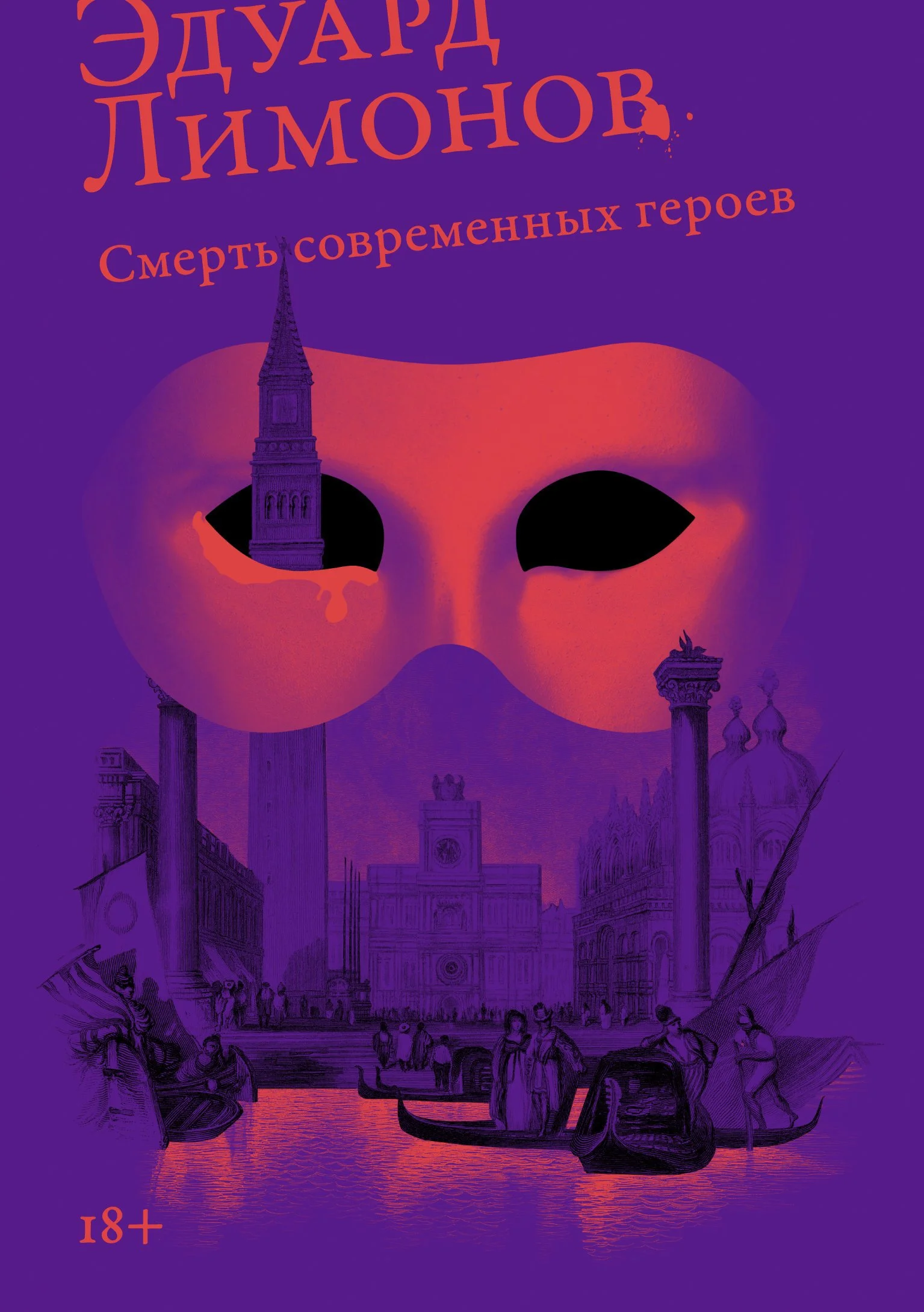
The Death of Modern Heroes
Simultaneously, I worked on the cover for The Death of Modern Heroes. This novel is about a trip to Venice taken by three completely different people. The travelers include an American editor, an idler and potential gigolo, and an imposing Englishwoman who is also a drug dealer. Nothing good will come of this trip and the journey will end in tragedy.
I don’t have much to say about this design. I came up with it knowing only the title of the book and its synopsis. But, of course, I read the book to ensure that my concept was accurate. After that, I created the final version.

The Kharkov Trilogy
Next, I had to design the covers for The Kharkov Trilogy, which is quite different from Limonov’s previous works. The Kharkov Trilogy is a series of novels about the author’s childhood and youth.
Ours Was A Great Epoch vividly depicts the life and atmosphere of the city after the end of World War II through Limonov’s childhood memories. I began my search with old Soviet postcards featuring children. My initial idea was to depict a lively little child, gazing with admiration at his “Titan-like” parents, who bore the weight of the world after the war.
Sketches
However, I ultimately decided to illustrate the street where our little hero lived – essentially, his entire world. I wanted to make the cover warmer and cozier. I walked up and down this street on Google Maps, found numerous archival photographs and verified the construction dates of various buildings. Obviously, there wasn’t a panoramic historic photo of the street, so I made a collage from a collection of photographs. The Soviet red “rainbow” symbolizes the hero’s idealistic view of the USSR.
Final cover
The second volume, A Memoir of A Russian Punk details the author’s first self-transformation: the decision of young Eduard Savenko, after being beaten up at age nine, to become a hardcore street hooligan. It’s a harsh and sometimes disturbing novel. For this one, I had only one idea in mind, and I am pleased with how striking the cover turned out.
Final cover
The last book for which I needed to design a cover was The Young Scoundrel. This novel continues the story of this same boy’s later decision to retrace his steps in the opposite direction, transforming himself in his early twenties from hooligan to bohemian writer.
Working on this book was complicated by the rigid stylistic constraints set by the previous books. I had six finished covers and I wanted to complete the project on a high note, even though I was tired of working on it. From the very start, I decided that I should like each cover equally.
For all the covers in the series, I started by considering which colors I associated with each particular book. This often provided a clue as to the direction I should take. I immediately chose the color scheme for this nostalgic and happy book about youth and coming of age. However, I struggled with the main idea. I attempted to place a photograph of Limonov himself on the cover. I wanted to convey both the joy of youth and its subtle melancholy.
Sketches
I decided to make the central element of the cover a monument to Taras Shevchenko, where the characters spend half of the book. They drink there, feel sad, meet and break up.
But no matter what I did, the protagonist on the cover always felt like an extraneous element.
Then it hit me. It would be sufficient to place the “scoundrel’s” autograph on the monument. Through his series, Limonov created a kind of monument to Kharkiv (modern spelling of Kharkov), and I wanted to depict the impact left by the author. And what could be more rebellious and fitting to Limonov’s character than vandalizing a monument to a famous poet?
I wanted the monument to be depicted as an illustration. Eventually, I came across an old website, last updated in 2013, operated by an American collector of travel brochures (travelbrochuregraphics.com). There, I found the perfect image – the uncredited cover of a 1938 Intourist brochure, though it was in very poor quality. I searched for it everywhere, including various library catalogs, but had no luck. Finally, I tracked down the owner of the website on social media. I described the situation to him and he was kind enough to find the brochure in his basement, scan it, and send me a high-resolution copy. Thank you, David!


Something went wrong
I finished the cover for The Young Scoundrel in January 2022, exactly one year after I began working on the project. During the process, I read all seven planned novels and then read five more to maintain my momentum. At the same time, I studied critiques, listened to interviews and researched the circumstances surrounding the writing of the books. All of this, including the covers themselves, I did in my spare time, evenings and weekends – as a designer, I couldn’t afford to dedicate so much time to a single project.
Everyone really liked my designs. We got the covers approved by the author’s representatives and I even prepared them for printing (a tricky task, considering the three-Pantone color printing process). But these covers never made it to print.
How did this happen? At some point, the idea emerged to create two editions – a “classic” one and one aimed at a modern, younger audience. My covers were classified as “youth-oriented”, suitable for paperbacks. Meanwhile, our art director Yuri Buga took charge of the hardcover design. He created minimalist, classy covers featuring portraits of the author, an homage to the Soviet collected works editions of the 60s to 80s. I helped select the photographs.
We began publishing Limonov’s works in hardcover, planning to launch the paperbacks with my design a bit later. However, the publishing plan kept changing, various circumstances arose, and the release was postponed again and again. Two years have passed since then and there are currently no plans to publish the paperback edition.
I still hope that this series will be published someday.
Epilogue
Despite the project never seeing the light of day, I’m glad I went through this journey. I learned a lot during the process and exceeded my own expectations. I immersed myself in Limonov’s biography and books, gaining a deeper understanding of my favourite writer than I had before. As a relatively happy ending, I can add that last year we published Limonov’s final, posthumous collection of poems, The Green Bishop’s Certificate, Folded in Half, and I was fortunate enough to design it. The knowledge I acquired about Limonov greatly helped me in designing this book.
And yes, it got printed.
All final covers
Editor, artworker and lifelong bibliophile.