The life of a Cover Designer, Uncovered: Emily Mahon

Working as a cover designer affords all sorts of benefits: free books, a variety of projects and of course the ability to walk into a bookshop on the other side of the country and see your design work on display. But as with everything in life, working as a cover designer comes with its own set of challenges. Spine spoke with talented designer Emily Mahon to get her perspective.
One of the first challenges designers face is getting into the industry in the first place. Mahon graduated from Penn State University not quite sure what she wanted to do. After taking some core art classes whilst studying, she had ended up in a prestigious class of only 22 other pupils in the graphic design program. After working through a rapid succession of round-the-clock projects she found herself drawn to posters, album covers and book jackets. Asked about how she made the transition from this point to the next she told me, "The only jobs I applied for after I graduated were in book publishing. I ran around New York City getting leads and cold-calling various art directors, until I finally found an opening and landed my first job working for Picador Books whose paperback covers always felt current and beautiful."
source: www.emilymahon.com
source: www.emilymahon.com
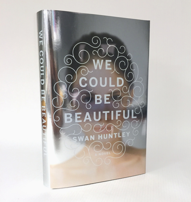
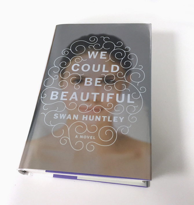
Much of Mahon’s work includes interesting production methods: When We Were Romans utilises die-cutting on the jacket, along with a design on the boards beneath and We Could Be Beautiful is printed on a wonderful metallic paper, giving a mirror effect to the design. Often convincing publishers to splash out the extra money required for these special finishes can be tough. Mahon’s approach is to produce the design concepts in early rounds—if the other departments need some convincing she has a go, but is also happy to help them come up with compromises: "For We Could Be Beautiful, the whole design was based on the concept of a mirror and the reader seeing their reflection in the book’s jacket. It definitely took some convincing to get this one by, but in the end we chose a printing method where we printed on a metallic paper stock instead of cost-prohibitive foil stamping and it was a much cheaper route. But yes, typically I like to come up with concepts that I feel will work and see if the budget allows for special effects. If not, I can always find a way to scale back and still get the concept across."
source: www.emilymahon.com
source: www.emilymahon.com
Some cover designers talk of being typecast by publishers, often only picked for a particular genre of design. This can be frustrating for those who want to expand their remit, but can equally work in your favour if you become known for a particular style and have clients drawn to your work for that purpose. Mahon agrees, "I have definitely been typecast for literary and commercial fiction, women’s historical fiction and certain non-fiction books. Although I do like a challenge, I’m not sure I’m necessarily the best fit to design thrillers, for instance. Sometimes I wish I had opportunities to design outside of my comfort zone, but at the same time I enjoy designing in these particular genres." Although Mahon mainly works within a selected few genres, she is able to provide a fresh approach to each brief – sticking to a genre without sticking firmly to well-trodden paths. This is particularly apparent in her typeface choices. Whilst many designers find a style they like and stick to it, Mahon’s work reflects a variety of approaches. She feels that ever cover is its "own special problem to solve" and so tries "not to have a preconceived style" when it comes to starting the project.
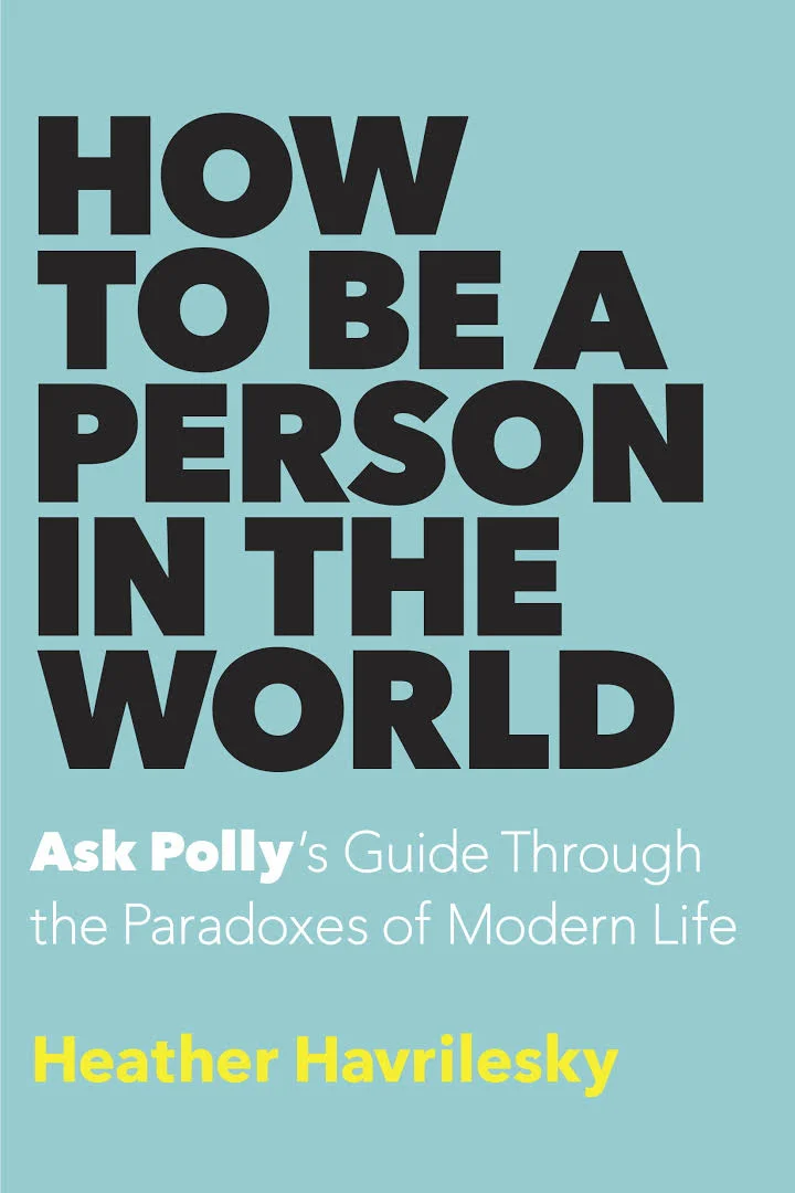
Author Heather Havrilesky's recent cover for How to be a Person in the World was designed by Mahon (who describes Havrilesky writing as "genius"). It’s a bold typographic approach, which Mahon went through a few stages to get to, "I tried several directions for this cover, with simple imagery and various type solutions. But in the end, they just wanted me to push the title. It made sense for an all-type cover, since her advice spans so many themes. I was also encouraged to go bold and bright, which led me to the bright blue background and strong black type."
Handwritten type is currently having a bit of a moment—particularly in the YA bookshelves. Design trends come and go, but Mahon tells me that some fundamental things about the publishing industry itself have changed in overall attitudes to cover design work, "Designers are taking so many more risks. It’s invigorating. I think readers are much more open as well, they have become more receptive to covers that are unconventional."
Perhaps one of the main enemies to a cover designer can be their own ego, working on a cover can be an intense process as a designer throws themselves into the story or subject. Rejections can feel personal, no matter how well we’ve been trained at school to take (constructive) criticism. This is a persistent debate within the industry: how lenient and willing to change our designs should we be? Many designers will be familiar with other departments dismantling their designs, but Mahon argues that it’s all about compromise, "It’s a balance of keeping ego out of it and trying not to feel too disappointed when covers are rejected (...) a lot of it involves letting go of good ideas and trying new things. There are so many people involved in approving a cover; just because everyone in-house loves a cover, doesn’t mean sales will and vice versa."


