Jaya Nicely on Designing Mirror Made of Rain

Jaya Nicely is a Los Angeles based art director, illustrator and designer. Here she takes us through her process for creating the sumptious cover for Mirror Made of Rain.
An exploration of class and tradition in contemporary India, Mirror Made of Rain shows how society encourages us to see ourselves through the eyes of others. Its main character Noomi travels through Kamalpur high society but is loath to change her hard-partying ways. Ultimately though she finds herself trapped within the same familial cycle of self-destructiveness and traditional expectations that she tried so hard to avoid.
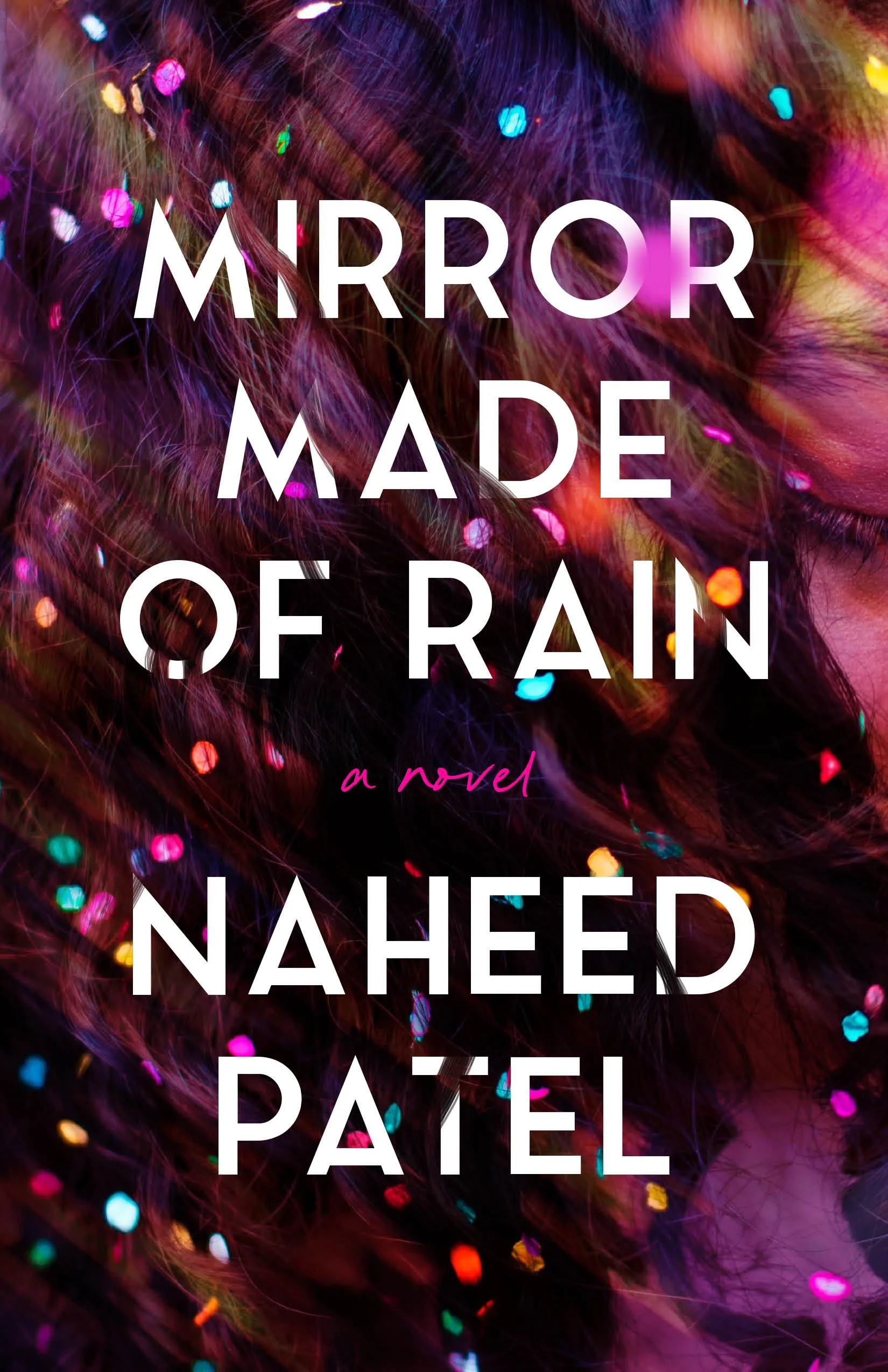
This was a cover that came together very quickly. In the initial meeting with Olivia Taylor Smith, Mirror’s editor, we discussed the idea of making it look like a fun, blurry night out. Another idea was to use fluid and reflective imagery, playing with the idea of water but trying to make it lush and evocative. Overall we wanted it to be colorful, contemporary, and avoid any stereotypical cover tropes of a book set in India. I was really excited to pursue those two main directions.
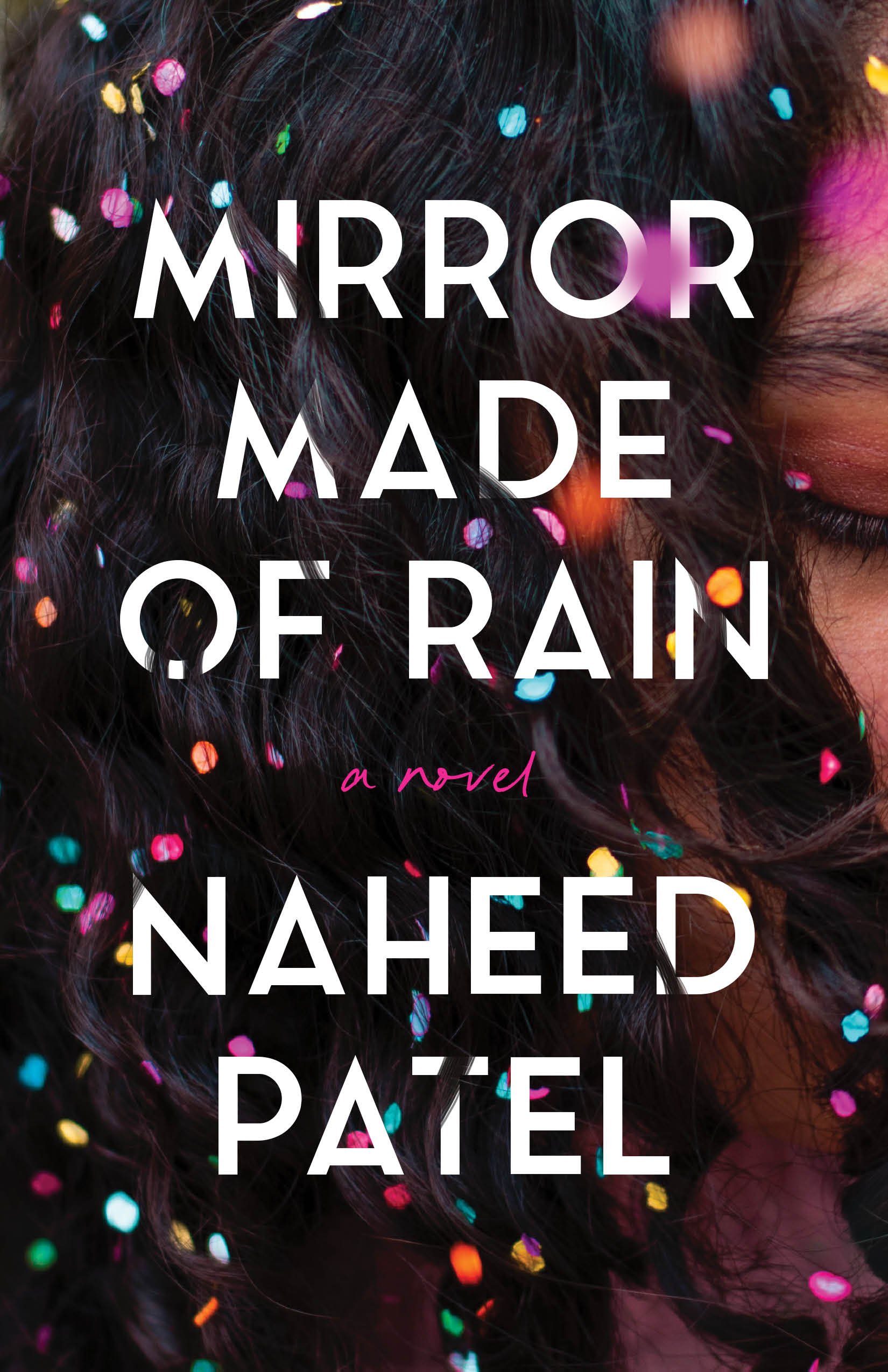
For the first round I used photographs that screamed “party”— I particularly liked the blue confetti version because it almost looked like water, or a puddle. The team loved the colors of these, but it didn't feel serious enough for the tone of the book. The more simple water option also didn’t feel quite right, but we all loved the title being quite large on the cover and also added the author’s middle name for the next comps. These were already heading in a good direction and I didn’t have to go back to the drawing board with completely new ideas.
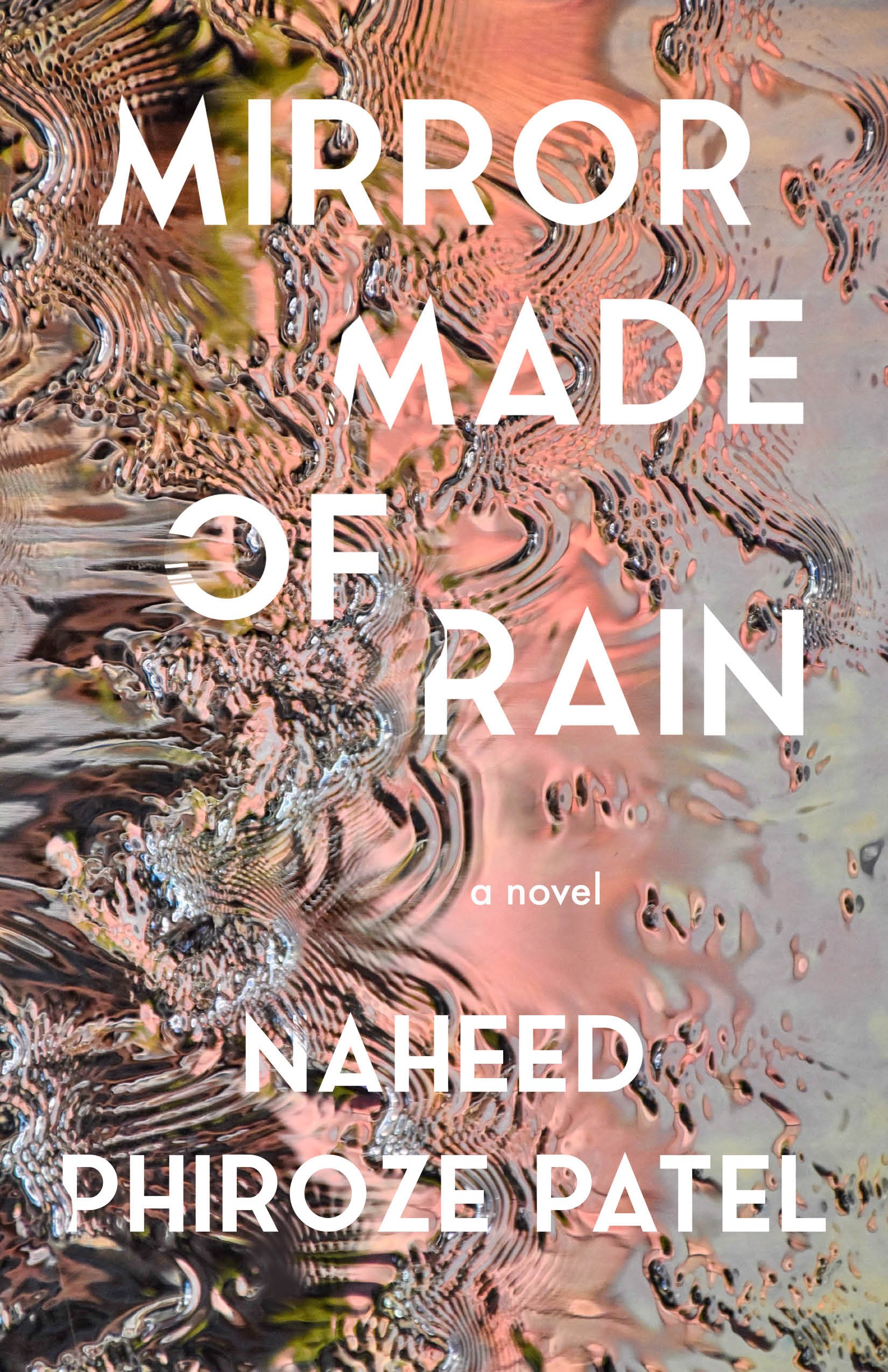
The second round was very close. I wanted to show the text being engulfed or disappearing partially into the imagery. I tried to convey the feeling of everything happening around you very quickly, or like a memory already passing you by. I also found this amazing photograph from Robert Keane which covered all the themes we talked about for the cover and more.
Photo: Robert Keane
I believe these three ideas were then shown to the author.
Naheed loved the version with Robert’s photograph and for round three we just did some minor text tweaks and alternate ways of playing with the image.
In the end we kept the photograph almost as-is—sometimes if you have the right artwork you just have to let it shine! The only minor tweak is that I turned the peach tones a bit more pink (the author’s favorite color.)
Final cover
I’m really happy with how this cover turned out and all the feedback has been very rewarding. Mirror got the right gears turning in my head and I felt inspired from the start. Thank you to Naheed for writing such an amazing book and to Olivia for championing my vision for this cover.
Editor, artworker and lifelong bibliophile.


