Kapo Ng on designing for Samrat Upadhyay's Mad Country

Among the wonderful book jackets that NYC based Kapo Ng has worked on is Samrat Upadhyay's Mad Country. Here the designer details for Spine how this cover came together.
I love tackling challenges when it comes to cover design, which is why it was exciting for me to design a cover for a collection of short stories. The main decision with any cover is deciding whether I should choose an element from a single story as inspiration, create something more general that speaks to the collection as a whole or do something totally unrelated—which can be a challenge for any book, but especially so with a collection like this one.
Samrat Upadhyay's new collection brings us stories of thieves and lovers, political prisoners and fractured families, journalists in Nepal doing their jobs under government death threats and Nepali-Americans navigating the strange customs of life in the United States. I decided designing one element from a specific occurrence could not capture the varied people and their stories as brought to life by the author, so, I began to think of something more general that could bring these characters, themes and countries together.
Cover design comes with deadlines and this one was very rushed. I was given one week to work on the project, and within that timeframe I decided that using stock illustrations would be the most efficient way to create the graphic.
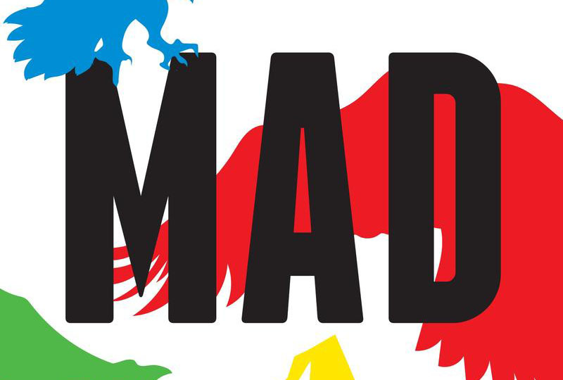
I began by selecting some iconic vector images of the Nepali summit of Mount Everest and the flying vultures and then modifying the art to look the way I wanted. Specifically, I wanted the placement of the birds and the angles of their wings to indicate chaos below. For the colors, I used the colors of the Lung Ta prayer flag: blue, white, red, green, and yellow. The five colors represent the five elements and the Nepali people hang these prayer flags on the mountain to invoke blessings among other things.
I also incorporated elements of the West, for balance, through typeface choices like the sans serif font. A lucky coincidence helped further my goal of balancing eastern and western elements when I noticed that it was easy to mistake one of the red vultures for the American Bald Eagle.
I presented the editor several different options within a week. He picked my favorite requesting only a few minor adjustments. I’m very happy with the end result that you are seeing now!
Editor, artworker and lifelong bibliophile.
