Book

Steve Attardo on Designing Nicole Dennis-Benn's Patsy

I wasn’t in the office when the finished jackets for Patsy arrived. The first time I saw them they were stacked neatly next to my keyboard on top of a few other hot-off-the-press jackets. I immediately inspected every line, felt the paper stock, ran my hands over the surface and exhaled in relief. Then smiled and wrapped every book on my window ledge with them. A wall of Patsy! This one was special for me. I started drawing its roadmap years ago, navigating conversations about race and sexuality, and sketching ideas that would be creatively challenging to myself and potentially for the company. I know I’m not curing cancer behind my iMac over here, but as I held this piece of paper soaked with vivid violet, orange, and red inks, I felt the weight of holding something I knew would be important to so many individuals. A portal to transport them into an imagined world where they would meet people whom they needed to meet. People who would help them find some inner peace and a place to channel their emotions, suppressed and otherwise. A tonic, in some ways, to the insensitive and close-minded chatter that serpentines it’s way through our society. When the design process began, I knew I needed to work from a place of authenticity and acuity for how we currently talk about love and equality. When the process ended however, I wondered, did any of that even matter? 

Steve Attardo on Designing Nicole Dennis-Benn's Patsy

Spine Podcast, Season 3, Episode 5: Mark Campbell

For this episode Holly Dunn interviews Mark Campbell, Head of Design at HarperCollins Australia and New Zealand, and President of the Australian Book Designers Association (ABDA.) They have an in-depth conversation on the working relationship between art director and designer. They also review results from a survey conducted by the ABDA in 2018. The survey’s focus was of the work experience among the ABDA book-design community, covering things such as contracts and revisions.

Spine Podcast, Season 3, Episode 5: Mark Campbell

Mira Jacob, The Creation of Good Talk: A Memoir in Conversations

Back in 2014, writer Mira Jacob's six-year-old son Z became obsessed with Michael Jackson. He wanted to dance like Michael, he wanted to look like Michael, and what began as Z's questions about his pop-star obsession spread into deeper questions about skin and color and race and family. Jacob is East Indian and her husband is Jewish, and Z wanted to understand who he was.

When Z learned about the killing of Michael Brown, a black man shot to death by a white police officer in Ferguson, Missouri, the questions grew more complex, and carried fear.

Mira Jacob, The Creation of Good Talk: A Memoir in Conversations

Shine On: Anne Jordan and Mitch Goldstein Shed Light on the Cover of M. Joy’s The Unnaturals

For designers Anne Jordan and Mitch Goldstein, a book’s insides should always dictate its cover design. Design begins from within, after all, in the guts of the thing. For the cover of M. Joy’s young adult dystopian novel The Unnaturals, new from inclusive indie publisher Wellington Square Media, Jordan and Goldstein got not only creative but downright kinetic with blue light, a driving a motif throughout the novel.

Shine On: Anne Jordan and Mitch Goldstein Shed Light on the Cover of M. Joy’s The Unnaturals

The Writer's Practice: Steve Rushin

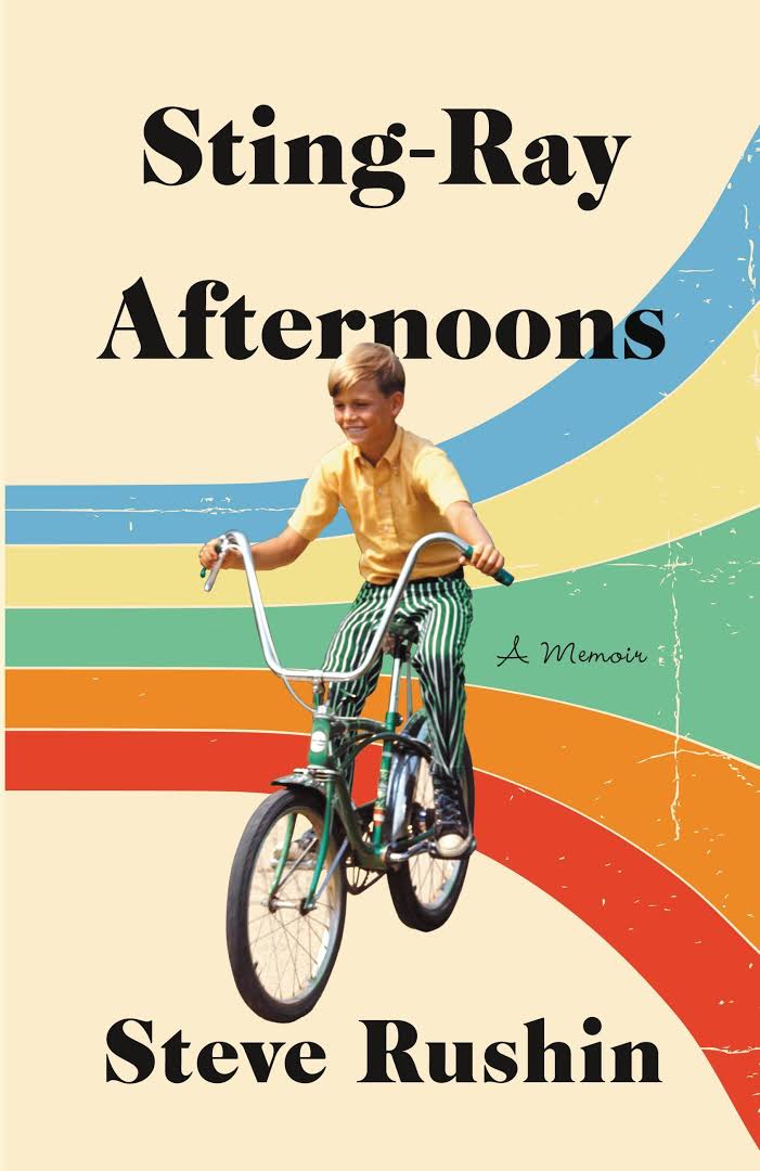
During his 30-year career with Sports Illustrated, Steve Rushin has written in press boxes and hotel rooms, on airplanes and shuttle buses, and aboard a ship crossing the Drake Passage to Antarctica. But at home in Connecticut, where he composed most of his recent memoir Sting-Ray Afternoons, Rushin sits (or reclines) in a small home office surrounded by books, papers, folders, and not a few tchotchkes…

The Writer's Practice: Steve Rushin

Cover Designer, Zoe Norvell, on The Redemption of Galen Pike

Zoe Norvell is a Brooklyn based freelance cover designer. Among her incredible portfolio of work is the cover design for The Redemption of Galen Pike, by Carys Davies. Here Norvell details her process for developing the work, in her own words.

Cover Designer, Zoe Norvell, on The Redemption of Galen Pike

Author Janet McNally on Writing Girls in the Moon

"I don’t remember much of the early part of writing Girls In the Moon, because I started when the twins were ten months old and those months were all a blur. Maybe that was good for me! … I can’t remember much about where the ideas came from, but that’s what happens with many of my projects. I’m almost a believer in the Muse—some things just come to me, and they turn into something larger in a way that I can’t track later."

Author Janet McNally on Writing Girls in the Moon

Q & A with Designer Aurora Parlagreco

"I think children's books are special because they often communicate big, complicated ideas in the simplest way. The challenge in designing covers for these books is similar in that you want to create something relatable but also aspirational; something that is age-appropriate but also speaks to who readers want to be. I love being able to create covers for a range of ages and genres because I have the opportunity to work with many different artists and there is always room for experimentation."

Q & A with Designer Aurora Parlagreco

Ray Shappell, A Totally Awkward Love Story

"A Totally Awkward Love Story was the most fun I’ve had designing a book cover to date. It started while reading the manuscript, about a boy and a girl who fall in love while trying to lose their virginity. I laughed out loud so many times at how hilarious awkward and raunchy the story was. It is a sweet romantic comedy at it’s core, but since it is very mature, it would compete in a more sophisticated/older part of the Young Adult market, with a larger chance for cross-over appeal. I love comedy, so it was my goal to create a design that was equally hilarious to the story that my thirty-something year old friends would want to read."

Ray Shappell, A Totally Awkward Love Story

Catherine Casalino, Designing an Unmistakable Cover

The most enjoyable part of cover design for me is coming up with something concrete and visual to illustrate an idea. If the idea is straightforward, the solution is usually pretty simple— if you want to say "love" in a visual way, you draw a heart— but when the idea is complex, like the idea behind Unmistakable (Portfolio Penguin 2016), you need an image that hits several notes at once.

Catherine Casalino, Designing an Unmistakable Cover

Justine Anweiler, We'll Always Have Paris, and A Manual For Cleaning Women

"I tend to think I’m more of a curator and that the true talent of many of my favourite covers (both one’s I’ve been involved in and one’s that I admire) lie in the hand of the illustrator behind it. As a visual consumer I prefer to feel the human that created the work of art and I apply this to the covers I create. Although I love slick traditional Swiss type that’s adhering to the strictest of grids, I much prefer an opinion confidently expressed through imperfect mark making."

Justine Anweiler, We'll Always Have Paris, and A Manual For Cleaning Women

Rachel Willey, Designing the Cover of Brit Bennett's The Mothers

"From the very beginning, The Mothers was described as a book that was going to be a literary event upon it’s release and our team at Riverhead wanted to be sure that this was communicated through it’s cover. Even though this was Brit’s first novel we wanted to make a big, bold move and grab the attention that she deserved."

Rachel Willey, Designing the Cover of Brit Bennett's The Mothers

Holly Dunn, Creating a Modern Mansfield

Holly Dunn is a book cover designer and book YouTuber residing in London. Her work includes a cover for Katherine Mansfeild's The Garden Party: And Other Stories, which originally began as a personal project and was later licensed by HarperCollins. Here she details how the project developed, in her own words.

Holly Dunn, Creating a Modern Mansfield

Covering Horror

After 27 years at Penguin Random House, Senior VP and Executive Creative Director Paul Buckley possesses an enviable amount of professional freedom. "It's up to me what I choose to art direct or what I choose to design personally," he told Spine. He and his staff oversee 16 imprints, annually shepherding more than 1,000 book covers and jackets through the design process. Buckley himself designs several dozen. But despite attending the School of Visual Arts on an illustration scholarship, Buckley had never illustrated for Penguin. "In all these years I've never tried to pitch myself as an illustrator to my team," he said. "I can always find someone far better than myself." Or could until Penguin decided to publish a series of well-known horror titles as part of its Classics imprint.

Covering Horror

Jim Tierney on Designing Covers for the Kopp Sisters Novels

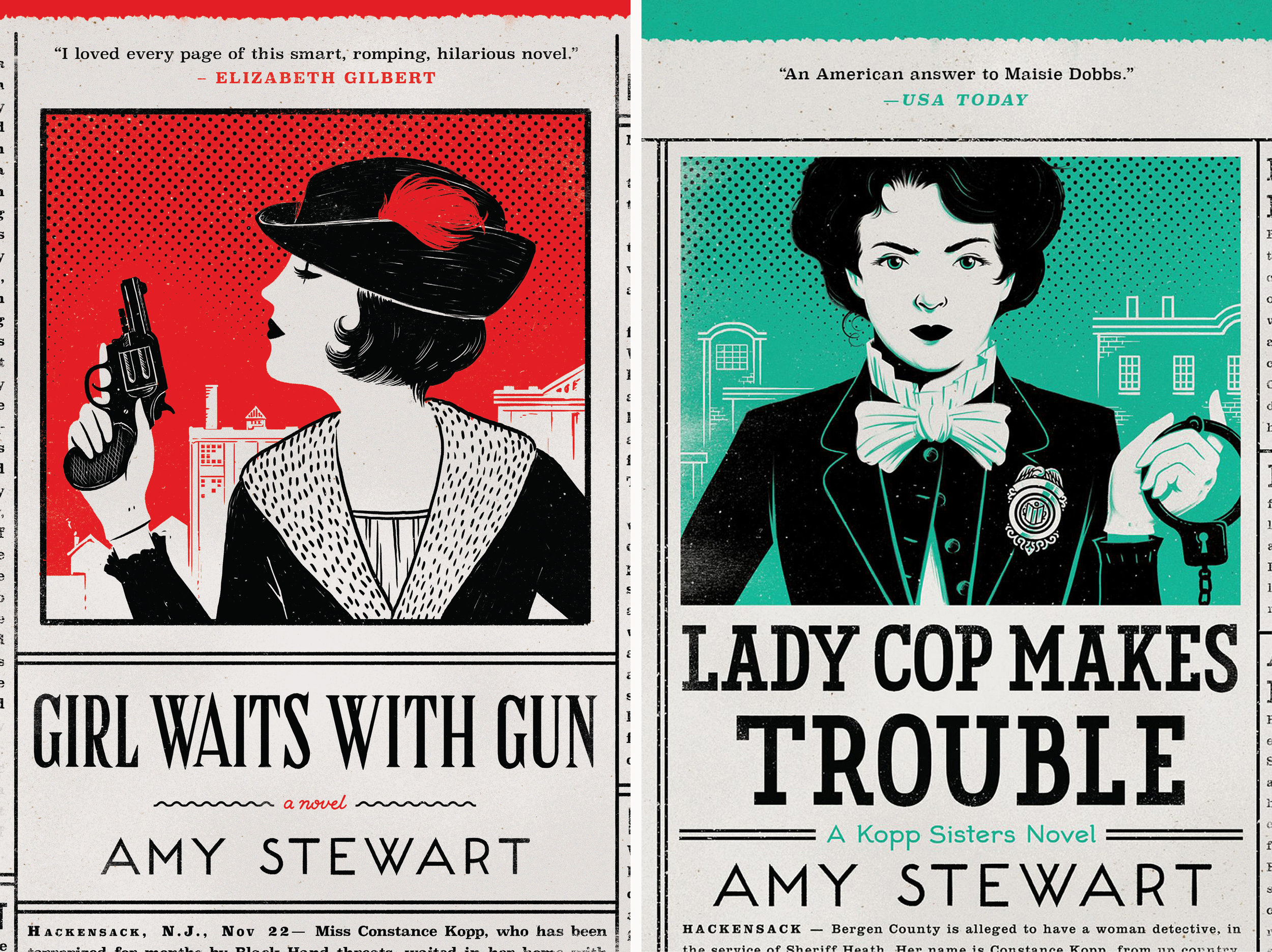
Jim Tierney is a book cover designer living in Brooklyn, NY. His work includes the covers for the Kopp Sisters Novels, Girl Waits With Gun and Lady Cop Makes Trouble. Here is his process for designing those, in his own words.

Jim Tierney on Designing Covers for the Kopp Sisters Novels